This morning I was greeted to the glory of yet another completely unwanted and unwarranted change to the general layout of the page for actually viewing a YouTube video; one that makes me question what trust fund script kiddie was put in charge of designing this layout and what board of beyond out of touch morons at Google actually approved this cluster fuck.
Okay, let’s take a look at the “normal” appearance of YouTube as it has been the past while. This screenshot was taken in Firefox with the browser in fullsscreen. Pretty standard stuff — the video is living in its rather large bubble, related videos are on the left, and the description and comments are on the right, with the nice bonus that the comments are effectively hidden unless I want to scroll down and read them.
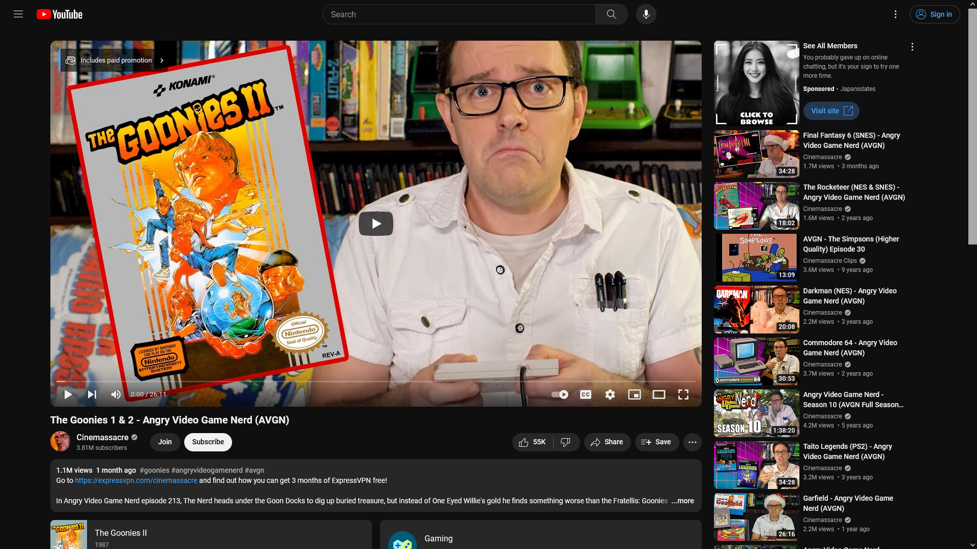
It’s nice. Dark mode is engaged due to it being a browser setting, but that makes the image comparison more proper for when I show the new display which honestly kind of makes me want to vomit.
Behold, the shittiest thing Google has made in a decade. Yes, even Stadia was better than this.
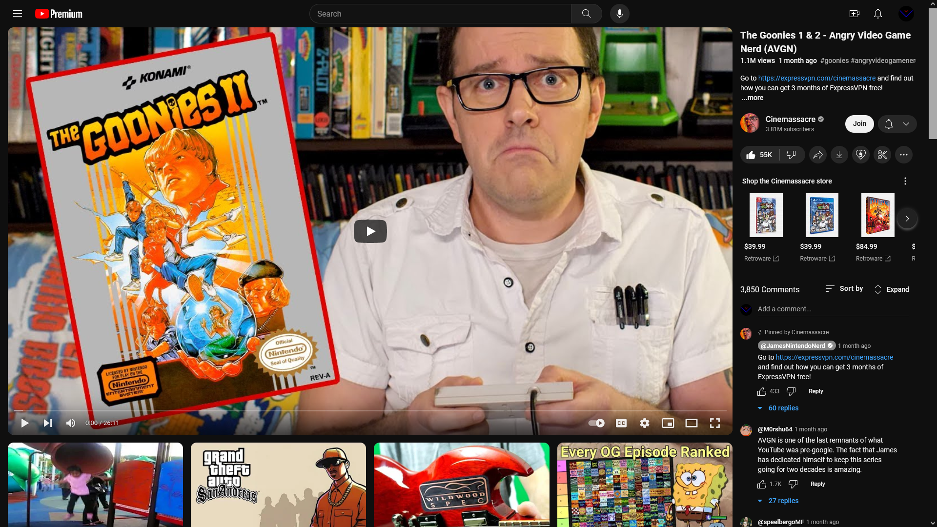
Look at this shit. Look at it! What in the fuck even is this? The video is slightly bigger, when it doesn’t need to be, which isn’t too much of an issue until… well… you see it. Basically everything that was below the video is now beside it, and vice-versa. Yeah, you scroll down for related suggestions, and to the right, crammed into something like 1/5th of the screen are the description and comments… which, as you notice, are now visible from the get-go. Nope, can’t avoid seeing them by simply not scrolling down, now you’re forced to see whatever comments from the peanut gallery the precious algorithm has decided you should be graced with.
I wish I felt like recording video if it in action but my god, you think it’s bad just sitting there, imagine trying to actually use this. If you do want to read comments it feels super tedious, and you’re reading in that tiny space all the way down, with the other 4/5ths of the page just being suggestions.
What fucking lunatic decided that is more important than meta information related to the video you’re actually watching, and, as much as they suck, the comments on that video which, hey, are engagement which, last we were all told, the precious algorithm loves.
But the real thing that made me laugh about this was, if you have the video player in theater mode or even in fullscreen you will wind up having a scrollbar at the bottom of the page. Yep, the CSS is so shitty that it breaks when it tries to go responsive….
….I repeat my earlier questions of seriously wondering what group of absolute fucking morons made this, let alone put into production. It’s a user experience nightmare, all made from a few subtle changes…. Now, to be clear, no, I’m not saying I could do better — CSS isn’t my thing at all, but as a user I know what I like, and I know what works, and this ain’t it. Muscle memory of scrolling down just a tad to leave a comment, or just moving the mouse down to click like is a waste here, which is more a minor but immediate complaint compared to the greater fact that this just looks like shit.
Of course, I do remember way back in the good old days when the video description was on the sidebar, but comments were still below the video — if I remember correctly they certainly always have been, and all in all it worked well. Hell, this wouldn’t be as bad if the video didn’t by default take up so much space (videos in the old days were only maybe at most half the width of the screen, if even that, and this is back in the 4:3 aspect ratio days) so there was enough space that everything didn’t feel, well, cramped.
That’s really what this is: cramped. Annoying to use. Annoying to look at. Impractical and quite simply pointless.
….and yet some kid with a college degree in web design somehow got a job at Google, got put into the YouTube design team and made this a thing that’s actually in use by customers.
This is dogshit from the ass of a decade and a half old chihuahua that’s eaten some mystery meat from behind a dumpster. I would say I expect better from Google but I don’t — they honestly kind of suck in more ways than many want to admit but, for whatever reason the Google cult is still alive and strong, acting like the company does no wrong… be it something major like Stadia being a complete failure (I still want apologies from people who said I was wrong to call it that on launch) or something as minor, but as absolutely in-your-face as… well.. this.
Google… Get it together.
Comments